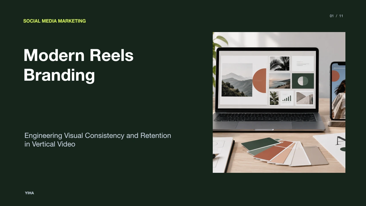
Modern Reels Branding
A practical guide to modern Reels branding, covering vertical frame safe zones, standardized motion design tokens, opening hook engineering, and template governance.
Free download · 4.9 MB11 editable slides · PowerPoint format
Download the editable PPTX
PPTX · 4.9 MB · 11 editable slides · Free to edit and reuse with attribution to Yiha.ai
View every slide
Use ← →, Home/End, or swipe on mobile
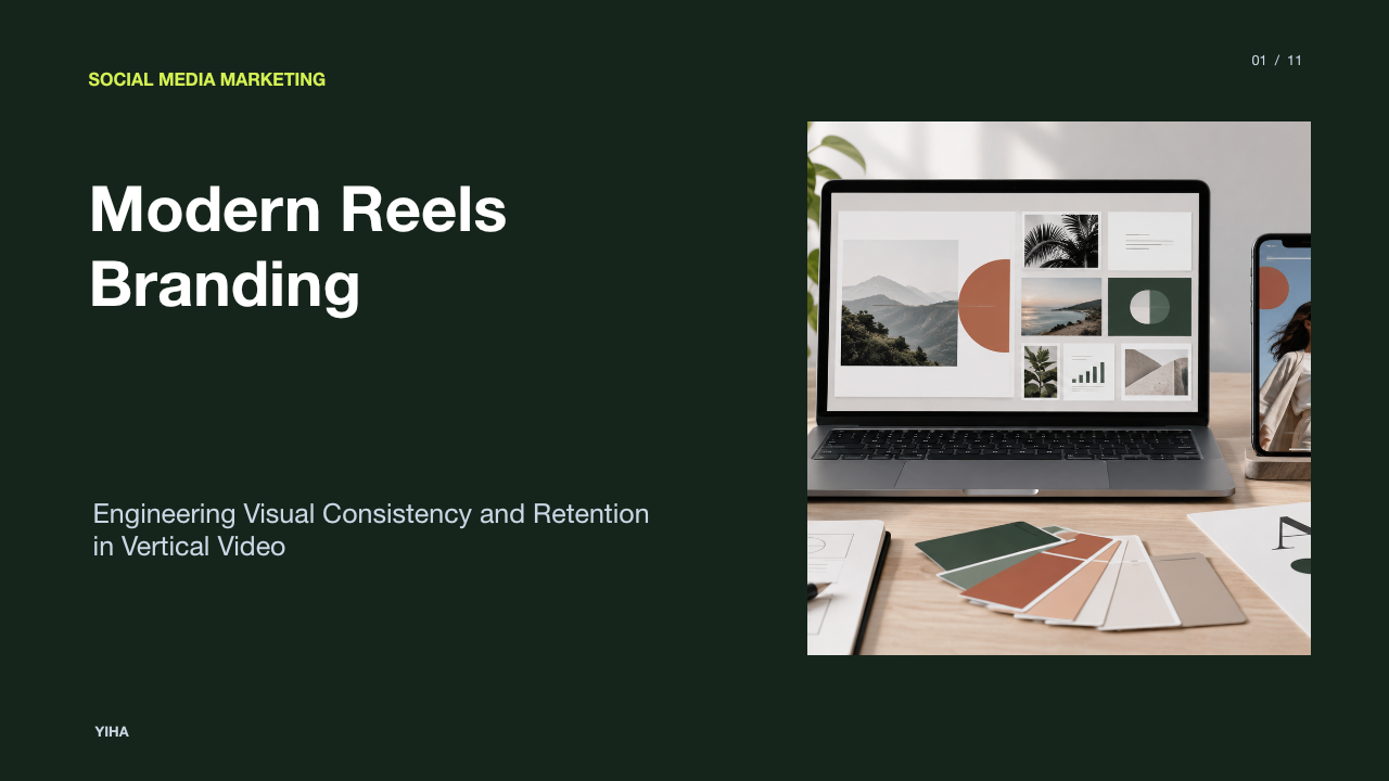
Short-form vertical video has transformed how audiences discover and evaluate organizations. Brand recognition is no longer anchored strictly to curated profile grids or static banners. Instead, dynamic motion identity across algorithmically distributed vertical video channels defines how viewers encounter, evaluate, and remember a business. Building an enduring brand presence on Instagram Reels requires treating vertical video not as disconnected daily recording, but as an engineered motion system.
Strategic Shift from Static Feeds to Vertical Video Discovery
Traditional social channels relied heavily on chronological or relationship-based feeds. Organizations curated static image grids, controlled typography in square assets, and assumed that prospective buyers would browse an account profile before consuming content. In contrast, algorithmic vertical feeds distribute media directly to non-followers based on behavioral engagement rather than pre-existing brand loyalty.
Because users encounter vertical video in rapid succession, visual recognition must occur during motion rather than on a static profile page. As noted in InfluenceFlow's Planning Guide, video planning requires distinct production workflows that schedule footage, editing, and distribution weeks ahead to maintain platform consistency. Furthermore, analysis from ContentBase points out that mobile viewers scroll quickly and make viewing decisions within the first moments of playback. Visual hierarchy, pacing, and layout clarity dictate whether someone watches or swipes away.
A central operational limitation of algorithmic distribution is reach volatility. Content performance fluctuates according to platform signals rather than subscriber counts. A brand system that relies exclusively on fleeting visual fads risks diluting its core identity. Marketing teams must therefore establish standardized visual markers that remain recognizable regardless of shifting distribution algorithms.
Frame Architecture and User Interface Safe Zone Dimensions
Vertical video occupies a standard 9:16 aspect ratio, typically exported at 1080 by 1920 pixels. While the video occupies the full display, the functional canvas for branding and readable copy is significantly restricted by native platform interfaces. Overlays such as profile usernames, captions, audio badges, and engagement buttons obscure substantial portions of the screen.
As outlined in Vivideo's Reels Guidelines, creators must position critical text, captions, and brand logos within safe zones, keeping focal messaging clear of the lower screen interface and the right-side interactive buttons. If a title or lower-third graphic sits too close to the edge, platform navigation elements will render it illegible across various smartphone displays.
To prevent clipping, designers establish an internal bounding area. For example, centering critical graphic components within a middle 1080 by 1350 pixel zone ensures assets display cleanly when previewed in feed streams or viewed on handsets with taller aspect ratios. The structural limitation of interface safe zones is reduced usable real estate. Creative teams must communicate narrative points concisely within a constrained central band without cluttering the screen.
Standardizing Visual Systems into Reusable Motion Design Tokens
Translating static identity guidelines into vertical motion requires clear operational standards. Rather than leaving font choices, sizing, and colors to individual video editors, organizations codify reusable motion design tokens. These tokens define brand color palettes, typographic hierarchy, lower-third graphic containers, and entrance animations.
Research compiled by CraftSelects shows that structured template kits establish consistency across vertical Reels, square posts, and Story placements while saving substantial editing time. Instead of building unique lower thirds for every recording session, teams draw from established motion assets. For example, an illustrative system might specify that primary titles appear in a bold sans-serif font against a high-contrast backing card, with secondary subtitles aligned to a predetermined vertical coordinate.
Motion design tokens eliminate ad-hoc styling variations and reduce editing friction across distributed teams. The primary constraint of standardized motion tokens is rigidity. If design rules are applied without flexibility for casual on-the-ground footage, content can appear overly corporate, disconnecting the brand from native community expectations.
Engineering the Opening Hook to Maximize Viewer Retention
The initial moments of a vertical video represent the highest drop-off period in playback. Passive viewers swipe past content almost instantly unless an immediate visual, kinetic, or textual hook interrupts the scrolling habit.
According to Influencer Marketing Hub, structured video templates provide pre-timed clip durations that support swift pacing. Effective hooks do not rely on slow logo animations or corporate title sequences. Instead, successful motion branding introduces high-contrast typography, clear focal subjects, and purposeful physical action immediately upon frame load.
An illustrative example of hook construction involves displaying a concise question or thesis statement in the upper safe zone paired with dynamic camera motion within the first two seconds. This combination communicates topic value before passive scrolling takes over. However, aggressive hook techniques carry risks. If an energetic opening promise fails to deliver substantive information in subsequent seconds, audience retention quickly collapses.
Typography and Accessibility Rules for Sound-Off Viewing
Mobile video consumption frequently takes place in public spaces, transit environments, or offices where users keep audio muted. Any motion identity that relies exclusively on spoken dialogue risks losing viewer comprehension entirely.
As discussed by ContentBase, typography-led video structures place text at the center of the experience, ensuring viewers grasp core points even before audio registers. Effective mobile typography requires bold, legible typefaces, concise sentence lengths, and generous padding around text blocks. In addition, FlowShorts emphasizes that templates rarely include built-in dialogue captions, making native caption stickers or hardcoded text essential for all key dialogue.
Accessibility standards also require high contrast between text layers and underlying video footage. Applying tinted background plates behind subtitles prevents characters from blending into busy scenes. The operational limitation of captioning lies in automated speech transcription errors. Editorial teams must manually review subtitles to ensure technical terminology, brand names, and grammar remain correct.
Modular Template Frameworks for Core Content Objectives
Rather than approaching each production day as a bespoke challenge, mature marketing organizations utilize modular template structures mapped to specific business objectives. Common modular formats include educational tutorials, product demonstrations, commentary videos, and listicles.
Insights from InfluenceFlow emphasize that content planning frameworks should balance educational, engaging, and promotional subjects rather than relying purely on sales pitches. Similarly, CraftSelects explains that dedicated slide layouts allow product features and explanatory details to unfold cleanly without overwhelming a single frame.
In an illustrative tutorial framework, a three-part modular layout might consist of a brief problem hook, followed by two structured demonstration cards, and concluding with a clear takeaway. The operational limitation of modular structures is creative fatigue. If a brand relies too heavily on identical three-step layouts, audiences learn to predict the flow and may swipe away earlier.
Audio Synchronization Dynamics and Commercial Licensing Limits
Sound design supports visual rhythm and brand recall, yet commercial accounts face distinct legal and technical boundaries. Cutting video clips directly to rhythmic audio cues creates a polished, professional cadence that improves viewing flow.
As explained by FlowShorts, native platform templates synchronize transitions to underlying musical tracks automatically. However, commercial accounts cannot legally use mainstream copyrighted music that is freely available to personal creator accounts. Using unlicensed consumer music risks video muting, regional blocking, or copyright violations. Organizations must use platform commercial music libraries or licensed third-party audio catalogs.
Guidance from Vivideo highlights that pairing vertical assets with platform-native pacing helps content blend naturally into user feeds. The key limitation is that commercial music libraries often lack the cultural momentum of viral pop songs. Marketing teams must therefore rely on crisp visual editing and original voiceover pacing rather than depending solely on trending audio.
Tooling Tradeoffs: In-App Workflows Versus Design Software
Creative teams must choose between native platform editing tools and external desktop software. In-app template builders allow creators to edit footage directly on mobile devices and immediately access native platform elements.
Conversely, CraftSelects notes that dedicated design suites allow teams to batch-edit assets across vertical Reels, square posts, and Story formats simultaneously, eliminating manual adjustments across placements. Furthermore, ContentBase explains that repeatable off-platform templates reduce decision fatigue around fonts, colors, and layout covers.
External design software provides robust brand kit controls, vector graphic support, and precise motion animation curves. The primary drawback of external desktop software is workflow speed. Creating assets outside the mobile platform requires exporting, transferring files, and manually verifying safe zone alignment within the platform app, slowing real-time response capability.
Brand Governance, Creative Fatigue, and Continuous Iteration
As content creation expands across distributed staff and agency partners, brand governance becomes critical. Without documented motion standards, individual creators can introduce conflicting typography, off-brand color variations, or irregular margin spacing.
According to InfluenceFlow, centralized planning templates and organized asset repositories ensure consistent brand voice and messaging across diverse channels. Concurrently, CraftSelects recommends rotating template layouts every few weeks to keep content fresh and prevent regular followers from experiencing visual fatigue.
Balancing visual discipline with creative variation requires regular asset reviews. Core identity tokens such as logo placement and typographic styling should remain locked, while background textures, hook phrasing, and framing styles rotate over time. Treating Reels branding as an evolving system allows organizations to sustain brand integrity and audience engagement across short-form video feeds.
Research sources
- Content Calendar & Planning Templates 2025 Guide |... · influenceflow.io
- 28 Best Instagram Reels Templates for Content Creators - CraftSelects · craftselects.com
- Instagram Reels Templates That Edit Fast · contentbase.com
- Instagram Reels Templates — Free, Ready to Customize | Vivideo · vivideo.ai
- Create Better Reels Faster with Instagram Reels Templates · influencermarketinghub.com
- Best Instagram Reels Templates: Free & Pro Options (2026) · flowshorts.app