Cbs Special Presentation Intro
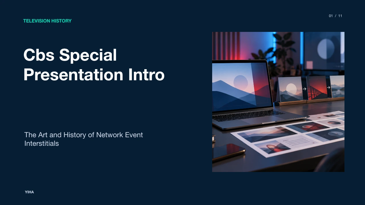
An in-depth analysis of the iconic CBS Special Presentation intro bumper, covering its 1973 debut, Mort Stevens brass fanfare, optical animation techniques, network scheduling role, and modern legacy in event broadcasting.
Free download · 4.9 MB11 editable slides · PowerPoint format
Download the editable PPTX
PPTX · 4.9 MB · 11 editable slides · Free to edit and reuse with attribution to Yiha.ai
View every slide
Use ← →, Home/End, or swipe on mobile
For generations of American television viewers, an abrupt burst of brass horns and spinning, multicolored typography meant regular programming was being set aside for something extraordinary. The CBS Special Presentation intro, introduced in autumn 1973, became one of the most recognizable broadcast interstitials in television history [1, 2]. Lasting just seven seconds, the sequence functioned as an unmistakable visual and auditory herald that prepared families for annual holiday traditions, entertainment pageants, and high-profile prime-time broadcasts [1, 2]. Understanding this bumper requires examining how broadcast networks scheduled marquee events, how optical and musical techniques converged to create instant excitement, and why the format continues to resonate decades after the broadcast model changed [1, 2].
The Golden Age of Network Scheduling and Broadcast Interstitials
During the three-network broadcast era dominated by CBS, NBC, and ABC, prime-time schedules followed rigid weekly routines [1, 2, 3]. Viewers tuned in at specific half-hour increments, and deviations from that weekly schedule represented significant logistical and financial decisions. When a network preempted regular series for a one-off program, it required visual and auditory signage to alert viewers that their scheduled show had been substituted [2, 4]. As documented in broadcast historical records on Station identification, station identifications, network bumpers, and interstitials developed partly to satisfy regulatory identification rules and partly to establish strong brand distinction between channels [2].
Regulatory requirements enforced by the Federal Communications Commission required terrestrial stations to identify themselves on-air at specific intervals, typically containing the station call sign and city of license [2]. Alongside local legal station identifications, national networks developed short interstitial packages, stingers, and bumpers that framed programming blocks [2]. Unlike regular commercial breaks, an interstitial was designed to retain audience attention during schedule transitions [2]. Archival footage preserved on the Internet Archive demonstrates that these short network graphics served as formal boundaries, transitioning the audience from regular sponsor breaks directly into high-value seasonal programs [4].
The 1973 Launch and Structure of the CBS Special Presentation
In autumn 1973, CBS rolled out an aggressive, high-energy bumper to precede its portfolio of prime-time entertainment specials [1]. As detailed in historical overviews of CBS, the network had built a dominant lineup of holiday broadcasts, beginning with the 1965 premiere of the animated special A Charlie Brown Christmas [1]. CBS expanded its stable of event programming through more than thirty Peanuts specials, Dr. Seuss adaptations like How the Grinch Stole Christmas in 1966, the stop-motion annual presentation of Rudolph the Red-Nosed Reindeer, and live broadcasts such as the Miss USA pageants and the Kennedy Center Honors [1].
To signal that a broadcast was not a standard episodic series, CBS introduced a seven-second animated opening sequence [1]. The visual composition featured the words "A CBS Special Presentation" displayed in colorful lettering using the ITC Avant Garde typeface, a geometric sans-serif widely associated with 1970s graphic design [1]. In the sequence, the word "SPECIAL", rendered in all capital letters and repeated in multiple bright colors, slowly zoomed out from the frame in a spinning counterclockwise motion against a deep black background [1]. As the music reached its climax, the layered words rapidly zoomed back into the center of the frame, collapsing into a single, crisp white word before cutting directly into the program [1].
Sonic Architecture: Editing Mort Stevens's 'Call to Danger'
Visual energy alone could not guarantee instant viewer attention across millions of living rooms. The CBS bumper derived its urgency from a propulsive musical fanfare that matched every frame of the animated sequence [1]. Rather than commissioning a brand-new composition for the bumper, CBS audio editors drew upon existing network catalog assets [1]. The fanfare originated as incidental dramatic underscore composed by Mort Stevens for the CBS crime drama Hawaii Five-O, titled "Call to Danger" on the Capitol Records soundtrack release [1].
Network sound engineers isolated an energetic passage featuring driving percussion, syncopated bongo drums, and punchy horn stabs [1, 5]. Using analog tape editing, the excerpt was condensed into a seven-second sounder with an unmistakable structure: an immediate drum roll that commanded quiet, rising brass lines that signaled anticipation, and a sharp final orchestral hit synchronized with the white typography snapping into position [1, 5]. Archival airings cataloged on the Internet Archive demonstrate that this musical stinger functioned like an acoustic siren, alerting household members to gather around the screen before the broadcast started [4].
Visual Mechanics: Slit-Scan Effects and Motion Typography
Creating the illusion of glowing, neon-like light trails in 1973 required specialized analog film photography rather than digital rendering software [1, 4]. Designers relied on optical printing benches, streak photography, and slit-scan camera techniques that manipulated light passes across physical art cards. The typography, set in ITC Avant Garde, was reproduced on clear high-contrast film negatives [1]. When backlit against optical printers, each color layer could be exposed over multiple camera passes.
As recorded in historical broadcasts preserved on the Internet Archive, the sequence produced vivid optical trails that simulated multi-dimensional rotation in virtual space [4]. By mechanically spinning the art card on a turntable while zooming the optical camera lens and controlling shutter exposure, technicians created concentric rings of saturated color. Because this work was completed chemically and photographically on physical film stock, the final print retained an organic grain, rich black density, and warm edge bloom that defined 1970s broadcast television aesthetics [1, 4].
Audience Conditioning and the Psychology of Annual Television
In the pre-home-video and pre-streaming era, holiday specials were genuinely ephemeral events [1, 6]. If a family missed an annual broadcast of a beloved special, there was no on-demand option; they had to wait an entire calendar year for the next opportunity [1, 6]. As documented in production records for A Charlie Brown Christmas, programs like the Vince Guaraldi-scored Peanuts special became shared cultural milestones, broadcasting annually across more than five decades [6]. Archival airchecks on the Internet Archive confirm that viewers encountered the spinning light streaks and fanfare immediately before these seasonal programs [7].
This annual scheduling created powerful behavioral conditioning [1, 6]. For Generation X and millennial children, the combination of bongo percussion and rotating typography signaled that homework could be set aside and that the holiday season had officially begun [1, 5, 6]. Analysis indicates that the seven-second interstitial served as a shared psychological threshold, bridging mundane commercial blocks and immersive seasonal storytelling [1, 2].
Competitive Strategies: CBS, NBC, and ABC Presentation Idents
CBS's aggressive fanfare was part of a larger competitive arms race among the Big Three broadcast networks [1, 3]. Each network sought to cultivate a distinct brand identity for its entertainment preemptions. While CBS leaned into dramatic, cinematic urgency with its spinning Avant Garde lettering, competitors deployed alternative visual metaphors [1]. NBC anchored its special broadcasts to the colorful plumage of its iconic peacock logo, highlighting color broadcast capability. Meanwhile, network historical documentation regarding the American Broadcasting Company outlines ABC's rapid expansion into made-for-television movies and holiday broadcasts, later acquiring broadcast rights to the Peanuts specials in 2001 after decades on CBS [3].
These divergent approaches reflected distinct philosophies of network brand architecture [1, 3]. NBC emphasized technological prestige and broadcast tradition, whereas ABC highlighted modern prime-time accessibility [3]. CBS positioned itself as the "Tiffany Network," using William S. Paley's standard of prestige programming to make each special feel like an exclusive theatrical premiere delivered directly into the home [1].
The Shift from Analog Optical Film to Computer Graphics
By the late 1980s and early 1990s, the broadcast production pipeline underwent a fundamental transformation [2]. Analog optical benches and physical film strips were replaced by computer-generated imagery and digital video effects hardware [2]. Broadcast networks overhauled their on-air packaging to reflect this clean, digital look [2]. As observed in off-air recordings from affiliate stations like WJW Channel 8 archived on the Internet Archive, CBS introduced refreshed computer-generated variations of the Special Presentation intro [4].
These updated versions retained the recognizable phrase and brass fanfare but replaced physical optical streak photography with computer-rendered geometric shapes, three-dimensional extrusion, and polished metallic surfaces [1, 4]. While digital technology offered razor-sharp fidelity and eliminated optical print dust, it also altered the tactile warmth and dynamic glow of the 1973 film original [1, 4]. Broadcast design analysis shows that digital consistency and efficiency took precedence over hand-crafted film opticals [2].
The Decline of Network Bumpers in the Multi-Channel Era
During the 1990s and 2000s, commercial and technological pressures began squeezing formal program interstitials out of regular broadcast schedules [2]. The rise of multi-channel cable television and satellite delivery fragmented national viewership, forcing broadcast networks to protect every second of audience attention. To prevent channel-surfing during end credits and commercial pods, networks adopted seamless programming strategies that collapsed the interval between consecutive programs.
Archival off-air recordings cataloged on the Internet Archive confirm that standalone graphic bumpers persisted for high-profile holiday broadcasts into December 1993, such as CBS's annual presentation of Rudolph the Red-Nosed Reindeer [4]. However, broader broadcast industry analysis indicates that routine network interstitials were progressively displaced by master control automation and digital on-screen graphics [2]. Rather than pausing programming for a dedicated seven-second fanfare, networks shifted toward persistent corner bugs and promotional graphics displayed directly over ongoing show footage [2]. As networks prioritized continuous program flow over grand ceremonial bumpers, the standalone broadcast interstitial transitioned from an everyday operational tool into a nostalgic relic of classic network television [2, 4].
Enduring Cultural Legacy and Modern Broadcast Reinterpretations
Despite the phase-out of traditional network bumpers in regular linear scheduling, the cultural footprint of the CBS Special Presentation intro remains powerful [1, 5]. Its combination of vibrant motion typography and brassy percussion became shorthand for vintage television excitement [1, 5]. When modern content creators seek to replicate the feeling of a standalone holiday event, they frequently pay homage to CBS's 1973 aesthetic [1, 5].
A prominent modern example appears in Marvel Studios' streaming productions on Disney+ [5]. As detailed in records for Marvel's Special Presentations, director and composer Michael Giacchino created a dedicated bumper and bongo-infused fanfare for one-off specials such as Werewolf by Night and The Guardians of the Galaxy Holiday Special [5]. Giacchino described the sequence as a deliberate love letter to the broadcast network bumpers of the 1970s and 1980s [5]. Designed by motion graphics firm Perception, the Marvel opening utilizes spinning typography, vibrant color trails, and urgent brass to invoke the exact feeling of an irregular, can't-miss broadcast event [5]. The enduring influence of the 1973 CBS bumper proves that thoughtfully synchronized music and motion graphics remain an effective way to turn any broadcast into an event [1, 5].
Research sources
- Station identification - Wikipedia · en.wikipedia.org
- CBS Special Presentation Intro Clip CBS/WJW 8 1993-12-02 : Free Download, Borrow, and Streaming : Internet Archive · archive.org
- NFL on CBS Presentation Intro PPT Template | Yiha · yiha.ai
- CBS - Wikipedia · en.wikipedia.org
- NFL on CBS Presentation Intro PPT Template | ReelMind · reelmind.ai
- A Charlie Brown Christmas - Wikipedia · en.wikipedia.org
- CBS Special Presentation Ident CBS/WJW 8 1993-12-22 : Free Download, Borrow, and Streaming : Internet Archive · archive.org
- American Broadcasting Company - Wikipedia · en.wikipedia.org
- Marvel's Special Presentations - Wikipedia · en.wikipedia.org